Components
The portable component surface: View, Text, Image and the structural
extensions around them, the input and pressable family, the scrolling and
list family, and Modal — every host component this platform renders as a
native GTK widget. Import all of them from "react-native"; the aliasing
that resolves that specifier to this package is set up by the Metro or vite
preset (see Package aliases).
- View
- Text
- Image
- SafeAreaView
- StatusBar
- ActivityIndicator
- Root
- NestedRoot
- IntrinsicRoot
- TextInput
- Switch
- Pressable
- TouchableOpacity
- TouchableHighlight
- TouchableWithoutFeedback
- ScrollView
- FlatList
- SectionList
- VirtualizedList
- Modal
Animated.View — the animated variant of View, driving opacity and
transform (and, conditionally, position and size) from Animated nodes
without a React re-render — is documented with the rest of the Animated
API in APIs, since both come from the same import.
Layout, paint and hit-testing
A few rules apply across every component in this section rather than to one of them:
-
zIndexorders paint and picking, per sibling group. GTK4 has no z-order property, so the container widget provides it: children are allocated in their Yoga order and painted (snapshotted) inzIndexorder, and a widget a higher-painting sibling covers declines to be hit-tested, so input follows the pixels. Layout itself is untouched — only the paint pass is sorted. The rules match RN, each checked rather than assumed:zIndexapplies whatever the component'spositionis (CSS requires a non-staticposition; neither RN nor this platform does); equal values keep document order (the sort is stable);undefinedbehaves as0, and negative values are legal and paint below untagged siblings; and the ordering is scoped to one sibling group — it creates no stacking context that escapes the parent, so a child can never paint above its parent's own siblings. That last rule is what to design around: to lift a dragged item over a drop target, put thezIndexon the dragged item's row, exactly as on iOS and Android.Animated.ViewanduseAnimatedStylereorder on the same terms asopacity— one widget write, no Yoga pass.One divergence from RN: an interactive native leaf inside a covered sibling — a
TextInput, aSwitch, aScrollViewviewport, a raw GTK widget in a slot — still receives a press even where a raised view visually covers it, because GTK's per-point hit test is consulted after a widget's children regardless of paint order.TextandImagedo not have a press prop of their own, so while something is raised above them they are excluded from hit-testing and the press reaches their nearestViewinstead — which is also why apointerEvents: "box-none"Viewwhose only child isTextlets a press fall through to whatever is behind it, while a sibling in that same container stays raised. -
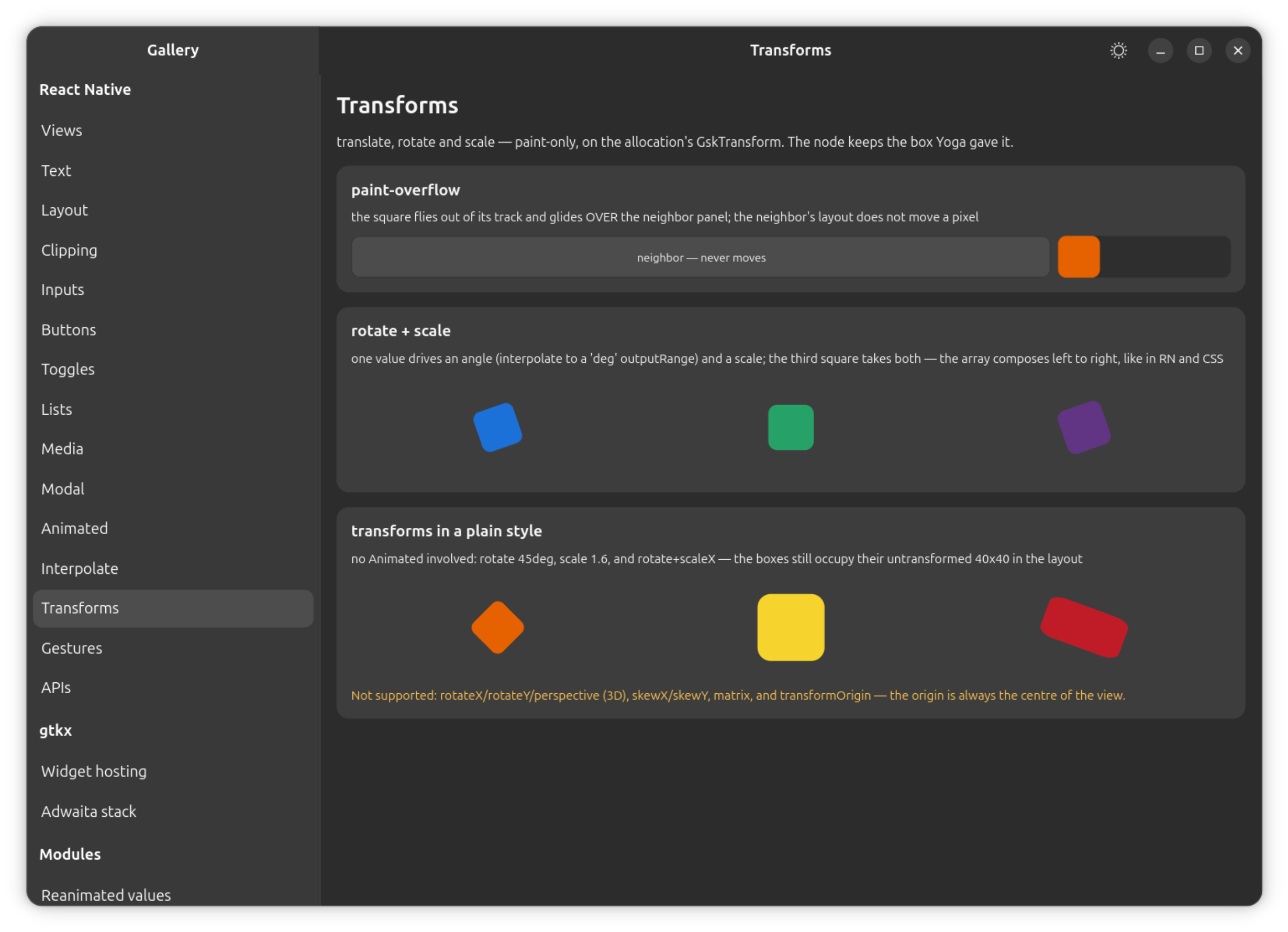
transformis paint-only, like RN.translateX/translateY,scale,scaleX,scaleYandrotate/rotateZapply to any component's style, not justAnimated.View; the array composes left to right, as in RN and CSS, and the origin is always the component's own center. A transformed child draws past its container and over siblings — later siblings stay on top unlesszIndexsays otherwise — without moving any ancestor, and input follows the transform: a rotated view is clickable in its rotated shape, unless a container'soverflow: "hidden"clips it at the edge exactly as it clips an untransformed child. Not supported: 3D transforms (rotateX,rotateY,perspective),skewX/skewY,matrix, andtransformOrigin(the origin is always centered). -
Animations never auto-stop. The desktop's own "reduce animations" preference is not applied automatically — GTK-side animations stay on to match
Animated, which runs on its own timers regardless of that setting. Honoring reduced motion is an app-level opt-in, exactly as it is in RN.
See Styling for the full style-property reference (what
reaches Yoga, what reaches GTK CSS, and what overflow does at the boundary
between the two).