Pressable
Profile: GTK · Backed by: View + click/motion event controllers
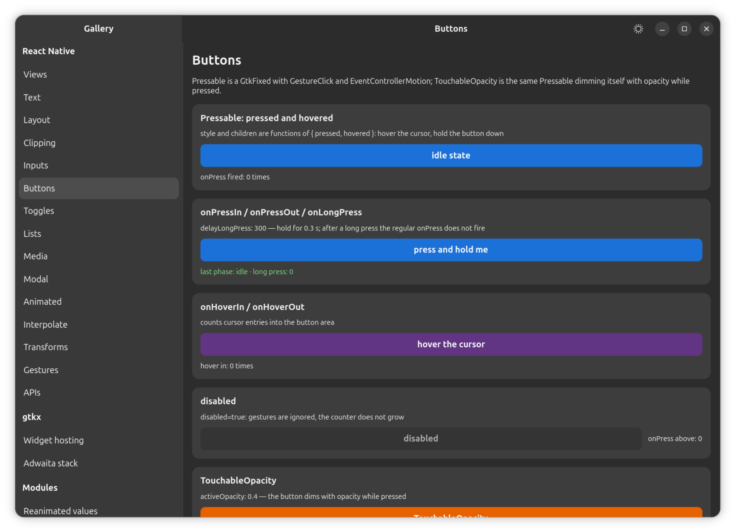
Supported props:
onPress(In/Out),onLongPress(delayLongPress),onHoverIn/onHoverOut,onFocus/onBlur,focusable,disabled.- A function-form
style/childrenreceiving{ pressed, hovered, focused }(react-native-web's own state shape). - Keyboard-operable:
focusabledefaults totruewheneveronPressis set (react-native-web's rule), which puts the view in the GTK focus chain — Tab and the arrow keys reach it, and Enter/Space fireonPressas they do on web and Android. - The
PressEventpayload matches RN's shape (locationX/Ytarget-relative,pageX/Ywindow-relative,identifier,target,force, a monotonictimestamp, single-elementtouches/changedTouches). hitSlopandpressRetentionOffseteach take a number or a per-edge object; the press rect defaults to RN's own{ top: 20, left: 20, right: 20, bottom: 30 }around the hit rect, and releasing outside it cancels rather than presses.
Differs from react-native:
hitSlopcannot escape a clipping ancestor — aScrollViewviewport or any view withoverflow: "hidden"— because GTK stops hit-testing at the clip; RN documents the identical limit on Android for the same reason.- Hover fires from touch input as well as from a mouse (react-native-web
filters that out; here a crossing event carries no device to filter on) —
GTK also sends a matching leave when a touch sequence ends, so the stuck
phantom hover the filter guards against does not arise; GTK's own
:hoverbehaves the same way.
Pressable (and the Touchable* components built on it, below) spread
PanResponder's panHandlers and participate in the same gesture responder
system View implements — see View for the shared negotiation,
termination and hitSlop rules, and Gestures for the
full model. PanResponder itself, and the Animated API these components
commonly drive, are documented in APIs.