Navigation
react-native-gtkx/navigation is a react-navigation
stack and sidebar navigator built on Adw.NavigationView and
Adw.NavigationSplitView — native Adwaita page transitions, header bar back
buttons and back gestures stay in sync with react-navigation state.
The subpath requires "Adw-1" in the app's gtkx.config.ts libraries
unconditionally. Importing it in an app that has not declared "Adw-1"
throws immediately, naming the fix; the Guide's plain-GTK profile page
covers what other subpaths do instead in that configuration.
Requirements
The package peers optionally on @react-navigation/native (v8), which must
be installed alongside it.
@react-navigation/native@8 itself peers on react-native: "*" — unlike
@react-navigation/core@8, which declares no react-native peer at all. An
app with no react-native package anywhere in its tree (a vite+gtkx app
with no Metro side, for example) gets an unmet-peer-dependency warning from
npm install for it. The warning is harmless: react-native-gtkx never
imports anything from the react-native package, so nothing at runtime
actually needs it present.
react-native-gtkx/navigation exports exactly two factories —
createStackNavigator and createSidebarNavigator — and the option/prop/
event types around them. The rest of the react-navigation surface
(useNavigation, useRoute, useFocusEffect, useIsFocused,
useNavigationContainerRef, CommonActions, StackActions,
usePreventRemove, NavigationContainer, and everything else) comes from
@react-navigation/native directly, not from this package.
Window chrome
Both navigators' header bars stand in for the window's own title bar, so the app should run with content chrome:
AppRegistry.runApplication(name, { ..., chrome: "content" })
Running with the default system chrome instead doubles the title bar, since the pages already bring their own header bars. In that case, each navigator logs a one-time development warning naming the fix.
Stack navigator
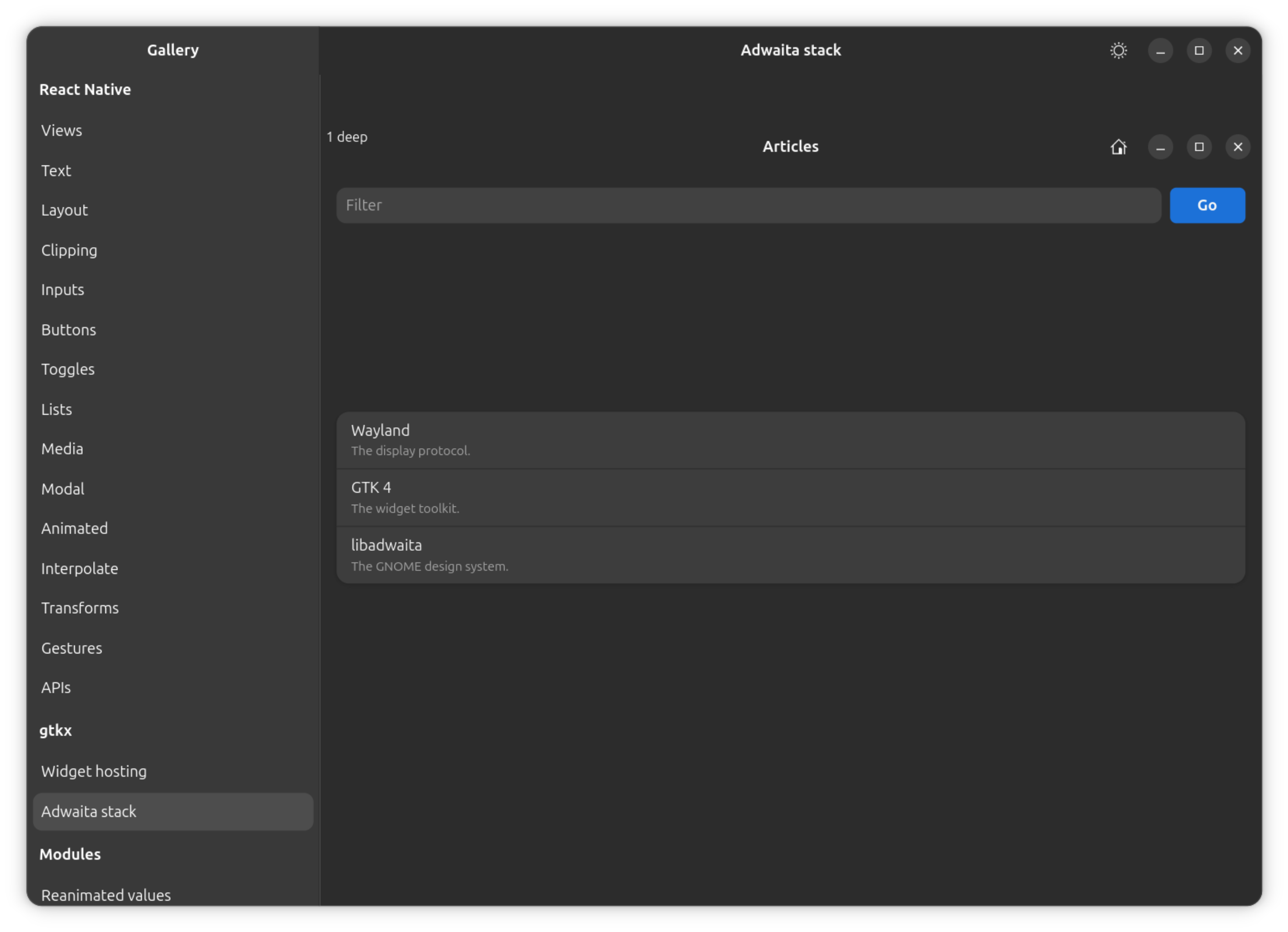
This demo bypasses react-navigation entirely (its own useState router); it
only proves the underlying native primitive the stack navigator above is
built on.
createStackNavigator() returns a Navigator/Screen pair used the same
way as @react-navigation/native-stack's:
import { NavigationContainer } from "@react-navigation/native"
import { createStackNavigator } from "react-native-gtkx/navigation"

const Stack = createStackNavigator()

const App = () => (
  <NavigationContainer>
    <Stack.Navigator>
      <Stack.Screen
        name="Home"
        component={HomeScreen}
      />
      <Stack.Screen
        name="Details"
        component={DetailsScreen}
        options={{ title: "Details page" }}
      />
    </Stack.Navigator>
  </NavigationContainer>
)
Screen options
title(string, default: route name) — Header bar title.headerShown(boolean, defaulttrue) — Shows the header bar for this screen.headerButtons(HeaderButton[]) — Native buttons packed at the end of the header bar, afterheaderRight. Each button is{ id, icon, tooltip, onPress };iconis an Adwaita symbolic icon name.headerLeft(() => ReactNode) — Content packed at the start of the header bar, in an intrinsic-size layout root — the content's own Yoga size is the slot size.headerRight(() => ReactNode) — Content packed at the end of the header bar, beforeheaderButtons.gestureEnabled(boolean, defaulttrue) —falsedisables the native back button, Escape and the back gesture for this screen. ProgrammaticgoBackstill works; this is also the mechanism behindusePreventRemove— a prevented route reports the same disabled state, so no native pop can race react-navigation state, and the route pops once the app lifts the guard.animation(string, default"default") — Differs from react-navigation: GTK has exactly one transition style, so this collapses to a boolean."none"turns transitions off; any other value — including native-stack's own style names such as"slide_from_bottom"or"fade"— turns transitions on and plays the standard Adwaita transition instead of the one requested. A non-"none"/"default"value still animates (it is not silently treated as"none") and logs a development warning once.
animation is a property of the whole view, not a per-page one, so there
is no per-screen granularity: the value used is read from whichever screen
is currently on top of the visible stack, recomputed on every navigation.
Setting it once via screenOptions — the same value for every screen — is
the reliable way to use it; the per-screen case only matters when
different screens genuinely disagree, and even then only the active
screen's value is observed. Interactive swipe-back gestures always animate
regardless of this setting, an Adwaita behavior that is not overridable
here.
When headerShown is false, the screen's content fills the page
directly, with no header bar; otherwise it renders inside the header bar's
content area. Each screen mounts its own layout root inside the page, so
the page's content allocation is exactly that screen's viewport.
Differs from react-navigation: a full custom header replacement
(@react-navigation/native-stack's header option) is not implemented —
headerLeft, headerRight and headerButtons compose within the
standard header bar instead. Deep-link url events never fire on
desktop; see APIs for Linking.
Transition events
The stack navigator emits two events on a screen's navigation object,
matching @react-navigation/stack and @react-navigation/native-stack:
transitionStart({ data: { closing: boolean } }) — Fires when a push/pop/replace transition starts, once per involved route (not once per gesture or tap).closingisfalsefor the route becoming visible,truefor the route leaving the visible stack.transitionEnd({ data: { closing: boolean } }) — Fires when the transition settles. Tied toAdwNavigationPage's ownshown/hiddensignals: it fires onshownfor the entering screen and onhiddenfor the leaving screen.transitionDuration(default 400 ms) is a fallback only, used when a page's own signal never arrives — a signal-less environment, or an intermediate screen skipped entirely by a multi-hop pop. When transitions are not animated, the real signals still fire immediately, sotransitionEndis never delayed by the fallback window.
A screen that stays mounted without actually entering or leaving the visible stack — the screen underneath a push, for example — receives neither event, matching upstream.
Differs from react-navigation: native pops (the back button, Escape, the
back gesture) do not fire either event today. A user-driven pop is
handled by the widget itself before the adapter is told about it, so there
is nothing to hook a transitionStart into; only programmatic navigation
(navigate, goBack, dispatch, …) fires these events.
Sidebar navigator
createSidebarNavigator() is the desktop equivalent of a drawer navigator,
built on Adw.NavigationSplitView: a persistent native sidebar (an
AdwActionRow per screen, in a GtkListBox with Adwaita's
navigation-sidebar styling) selects between parallel screens — TabRouter
semantics, not a stack.
import { createSidebarNavigator } from "react-native-gtkx/navigation"

const Sidebar = createSidebarNavigator()

const App = () => (
  <NavigationContainer>
    <Sidebar.Navigator sidebarTitle="Mail">
      <Sidebar.Screen
        name="Inbox"
        component={InboxScreen}
        options={{ icon: "mail-symbolic" }}
      />
      <Sidebar.Screen
        name="Trash"
        component={TrashScreen}
        options={{ icon: "user-trash-symbolic" }}
      />
    </Sidebar.Navigator>
  </NavigationContainer>
)
Navigator props
sidebarTitle(string, default"Sidebar") — Title of the sidebar pane's header bar.headerButtons(HeaderButton[]) — Buttons packed at the end of the content header bar; a screen's ownheaderButtonsoption overrides this entirely for that screen.sidebarHeaderLeft/sidebarHeaderRight(() => ReactNode) — Content packed at the start/end of the sidebar pane's own header bar — distinct from the content header'sheaderLeft/headerRight, which are per-screen options, because one sidebar pane is shared by every screen. Mounted through the same intrinsic content root as the content header, so it lays out as a horizontal, content-hugging cluster flush with natively packed buttons.sidebarHeaderTitle(() => ReactNode) — Replaces the sidebar header bar's title widget (a search entry, a switcher). Left unset,sidebarTitlerenders as a plain label.collapseWidth(number, sp; unset by default) — Width below which the split view collapses to the sidebar or the content pane alone, through a nativeAdw.Breakpoint. Unset by default: no breakpoint is mounted at all, so an app that never sets this sees no behavior change.minWidth/minHeight(number, px; default360/294) — The narrowest size the sidebar navigator's UI supports, applied to the breakpoint containercollapseWidthmounts. Ignored whencollapseWidthis unset, since no container exists then. The default is GNOME's own adaptive floor.sidebarContent((props: SidebarContentProps) => ReactNode) — Replaces the entire sidebar pane body.
collapseWidth is not driven by React state or useWindowDimensions: the
property flip happens inside GTK's own allocation pass, at no cost of a
React render for the resize itself.
Adwaita cannot measure a breakpoint container on its own — what it holds
changes with the breakpoints — so it otherwise reports a minimum size of
zero and warns that a width/height request must be set. Left at the
default, this is not an issue; an app whose content header bar needs more
room than the default (a segmented control as headerTitle, for example,
costs roughly 110 px on its own and cannot ellipsize the way a plain title
label can) must raise minWidth/minHeight — measured against the pane's
own content, not guessed. Setting it too low does not fail loudly: the
window resizes past what the pane can draw, and Adwaita clips the pane
instead of adapting it (an AdwNavigationSplitView exceeds AdwBreakpointBin width message in the system journal, felt as content
running off the edge). The sidebar pane's own width is separately bounded
between 180 and 280 px regardless of collapseWidth.
Screen options
title(string, default: route name) — Sidebar row and content header bar title.icon(string) — Adwaita symbolic icon name for the row's prefix. Ignored whencoloris also set — a row shows a colored dot or an icon, never both.color(string) — CSS color for a colored-dot prefix, replacingicon.colorwins when both are set.count(number) — Badge shown as the row's suffix. Hidden when0or unset.headerLeft/headerRight(() => ReactNode) — Content header bar start/end, per screen — a filter toggle group for a list, a back button plus star/trash for an open item.headerTitle(() => ReactNode) — Replaces the content header bar's title widget for this screen. Left unset, the header bar shows the page's own title automatically.headerButtons(HeaderButton[]) — Overrides the navigator-levelheaderButtonsprop for this screen.contentLayout("react-native" | "widget", default"react-native") — What the screen's body is."react-native"mounts it in a Yoga layout root that fills the pane, so<View style={{ flex: 1 }}>behaves the way it does anywhere else."widget"packs the body into the page directly, with no layout root in between, for a screen whose body is a GTK widget tree — GTK's own sizing (vexpand, a list's natural height) then applies normally. Under the default, a widget tree collapses instead, and quietly: every widget becomes a single Yoga leaf measured for its own natural size, so the container renders its first child, drops the rest, and reports the roughly 1 px it can shrink to, with no error anywhere. Mixing is per screen, not per subtree — a"widget"screen that wants React Native content somewhere inside it wraps that part inSlotContentitself.sidebarRow(() => ReactNode) — Draws the row directly instead of lettingtitle/icon/color/countcompose one. See Building sidebar rows below.group(string) — Section this row belongs to. See Grouping rows below.
A screen changes its own header shape from inside itself by calling
navigation.setOptions({ headerLeft, headerRight, headerTitle }) in an
effect keyed on whatever local state decides the shape — no navigator API
beyond the options themselves is involved. setOptions merges into the
previously resolved options rather than replacing them: a call that omits
headerRight does not clear a headerRight a previous call set, it
leaves it in place. A screen that flips between header shapes must give
every one of headerLeft, headerRight, headerTitle and headerButtons
an explicit value on every call — undefined counts as a real overwrite,
an absent key does not.
Building sidebar rows
There are three ways to put content in the sidebar, cheapest first — the
same ladder react-navigation's own tabBarIcon → drawerLabel →
drawerContent climbs:
title/icon/color/count— the convenience. Composes anAdwActionRowautomatically.sidebarRow(screen option) — draw one row yourself. The navigator keeps owning row behavior: selection, click →jumpTo, staying in step with navigation state, the collapsed reveal. Return anything aGtkListBoxRowcan hold — React Native content, GTK widgets, a differently configured Adwaita row.sidebarContent(navigator prop) — draw the whole pane, routing surface included:
<Sidebar.Navigator
  sidebarContent={({ routes, focusedIndex, jumpTo }) => (
    <View style={{ flex: 1 }}>
      <SearchField onSubmit={filterRoutes} />
      <ScrollView style={{ flex: 1 }}>
        {routes.map((route, index) => (
          <Pressable
            key={route.key}
            onPress={() => jumpTo(route.name)}
          >
            <Text
              style={{
                padding: 8,
                fontWeight: index === focusedIndex ? "700" : "400",
              }}
            >
              {route.title}
            </Text>
          </Pressable>
        ))}
      </ScrollView>
      <StorageUsageFooter />
    </View>
  )}
>
  <Sidebar.Screen
    name="Inbox"
    component={InboxScreen}
  />
  <Sidebar.Screen
    name="Trash"
    component={TrashScreen}
  />
</Sidebar.Navigator>
SidebarContentProps carries routes (each with key, name, resolved
options, resolved title, and focused), focusedIndex, and
jumpTo(name). route.title is already resolved (options.title, falling
back to the route name). jumpTo reveals the content pane when collapsed,
the same as a native row click — use it rather than dispatching directly,
so selection cannot drift from navigation state. The pane's header bar and
sidebarTitle still belong to the navigator; sidebarContent replaces only
the body under it. A sidebar built from GTK widgets instead of React
Native content wraps its own tree in WidgetContent, the same escape
hatch contentLayout: "widget" uses for a screen body.
The reason rungs 2 and 3 exist at all: AdwActionRow carries Adwaita's own
row metrics, not a default this package picked — measured at roughly
104 px per row (with a prefix and/or count laid out) against roughly 40 px
for a plain title-only row — and nothing passed to
title/icon/color/count changes that height. A screen on rung 1 has
no lever for it; a different height or density means climbing to
sidebarRow or sidebarContent.
Grouping rows
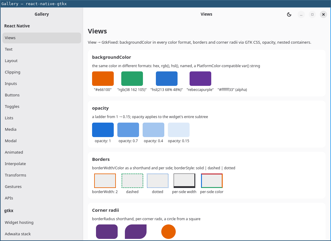
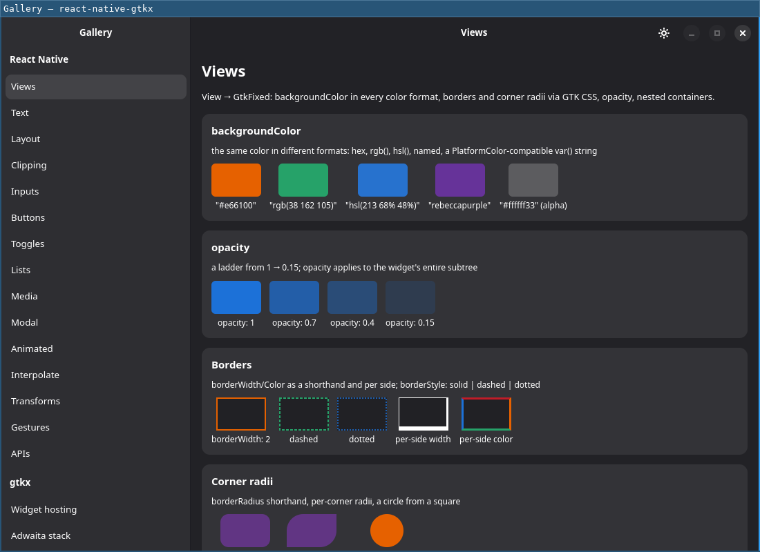
The gallery's own screenshots elsewhere on this site are all native GNOME/Adwaita chrome in the dark theme — this pair is the one deliberate light/dark comparison.
Consecutive screens sharing a group value get one Adwaita section header
above the first of them. The header is a decoration owned by the row below
it, not a row of its own — it sits outside the list's selection model and
outside its focus chain, so arrow keys and Tab walk past it and assistive
technology never announces a row that cannot be activated.
Grouping follows row order: screens in one group must be declared
together, and a group name reappearing after a gap starts a second header
rather than reordering anything. Leaving group unset on every screen —
the default — keeps the list flat.
Collapsing
Any route becoming active while collapsed reveals content
(AdwNavigationSplitView's showContent, a plain native property write,
not React state) — a row click or a programmatic navigate()/jumpTo();
the native back button that then appears reverses it. Re-selecting the
same, already-active row also reveals content again, since GTK's
row-selected does not refire for a re-click with no selection change.
Resizing back above collapseWidth and then below it again does not reset
the selection or which pane is showing — both simply persist across the
round trip, the same size-class behavior a mobile master-detail app relies
on.
Sidebar transition events
sidebarShown({ data: undefined }) — Fires when the split view's own back affordance (back button, Escape, back gesture) hides the content pane while collapsed, returning to the sidebar.
Differs from react-navigation: this is the one case where a native,
user-driven interaction does get an event. Unlike a stack pop, nothing is
removed from TabRouter's state when this happens — the same route stays
focused, only the visible pane changes — so there is no state change for
an app to observe any other way. sidebarShown fires on the currently
active route, never for content being revealed (that direction is already
an ordinary state change), and never at all when collapseWidth is unset.
Typed factories
createStackNavigator<ParamList>() and createSidebarNavigator<ParamList>()
are generic: the returned Navigator/Screen pair is typed against
ParamList, so a mistyped screen name or a mismatched param type is caught
at the JSX call site. Each factory has its own screen-props helper for a
component that reads route/navigation directly as props —
StackScreenProps<ParamList, RouteName> for the stack navigator,
SidebarScreenProps<ParamList, RouteName> for the sidebar navigator — and
its own navigation-helpers type for a component that instead reaches its
navigation object through useNavigation() (one component shared across
several routes, for example): useNavigation<StackNavigationHelpers>() /
useNavigation<SidebarNavigationHelpers>().
Exported types: StackNavigationOptions, StackNavigationEventMap,
StackNavigationHelpers, StackScreenProps, StackScreenConfig,
TypedStackNavigator, SidebarNavigationOptions,
SidebarNavigationEventMap, SidebarNavigationHelpers,
SidebarScreenProps, SidebarScreenConfig, TypedSidebarNavigator,
SidebarContentProps, HeaderButton.
Unsupported screen options
react-navigation's own navigator factory is untyped upstream, so neither
TypeScript nor the runtime otherwise says anything about a screen option
this adapter does not recognize (a @react-navigation/native-stack option
that does not apply here, for instance). Each navigator instead logs one
development-only warning per unknown option key, naming the option and why
it is ignored — for example, headerStyle/headerTintColor/
headerTitleStyle are ignored because Adwaita's theme owns the chrome
styling on this platform, presentation is ignored because only "card"
exists today, and detachInactiveScreens/freezeOnBlur/inactiveBehavior
are ignored because pushed pages always stay mounted, with no unmount/
freeze knob to offer. The warning fires once per navigator kind per key,
not once per screen or per render, and never in production.