Svg (react-native-gtkx/svg)
Vector graphics built from React state, in the shape of
react-native-svg — the
de-facto standard RN mirrors for SVG — rather than a shape invented from
scratch. Drawing goes through Gsk.Path/Gtk.Snapshot on a single custom
widget (the same mechanism the layout and viewbox widgets use internally),
not a rasterized image.
Svg and everything in this reference are exported only from
react-native-gtkx/svg, never from the main react-native-gtkx entry point.
react-native-svg is a separate package on every other React Native
platform — RN itself has no built-in Svg — so this project mirrors that
split instead of folding Svg into the main export surface, which would make
code written against it fail to compile anywhere else.
import Svg, { Circle, G, Path, Rect } from "react-native-svg"

const Icon = () => (
  <Svg
    width={24}
    height={24}
    viewBox="0 0 24 24"
  >
    <Circle
      cx={12}
      cy={12}
      r={10}
      fill="#1c71d8"
    />
    <Path
      d="M8 12 l3 3 l5 -6"
      stroke="white"
      strokeWidth={2}
      fill="none"
    />
  </Svg>
)
Import and aliasing
react-native-gtkx/svg re-exports its component set in react-native-svg's
own shape: Svg as both the default and a named export, everything else
named. The react-native-gtkx/metro and react-native-gtkx/vite presets
alias the bare react-native-svg package name onto this subpath
automatically, the same way they alias react-native itself, so portable
code that imports from react-native-svg runs unmodified. Apps using
neither preset can point their own bundler alias at react-native-gtkx/svg
by hand. react-native-svg itself is never a dependency of this package and
does not need to be installed — the alias works whether or not the real
package is present.
react-native-gtkx/dnd follows the exact same aliasing pattern for
react-native-reanimated-dnd; see dnd.md if drag-and-drop is also
part of the app being ported.
Svg
The root component. It is a Yoga leaf, sized entirely by style/flex — like
Image, never by measuring the widget, so nothing here is intrinsic-sized.
| Prop | Behavior |
|---|---|
width / height | Convenience props layered onto style, sizing the leaf. |
style | The general sizing/layout escape hatch, same as any other view. |
viewBox | "minX minY width height". Reshapes the internal coordinate system exactly like real SVG — Yoga never sees it. |
preserveAspectRatio | xMin/xMid/xMax × YMin/YMid/YMax, meet/slice, or none; defaults to xMidYMid meet. |
Content always clips to the allocated bounds. There is no overflow: visible
opt-out.
Shapes
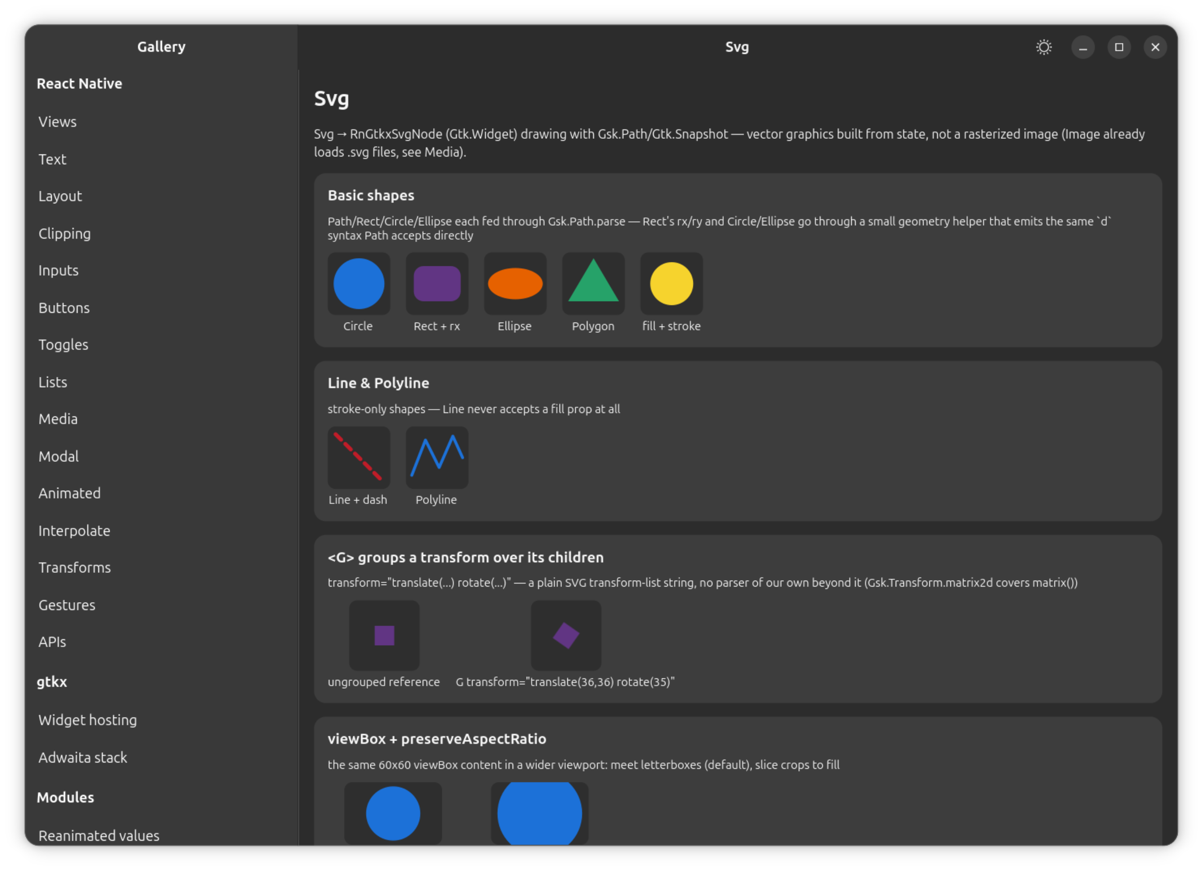
Path—dis handed straight toGsk.Path.parse(), which understands SVG path syntax natively. There is no path parser of this project's own.Rect—x/y/width/height/rx/ry.Circle—cx/cy/r.Ellipse—cx/cy/rx/ry.Line—x1/y1/x2/y2. Stroke-only: there is nofillprop at all onLine, not even one that is silently ignored.Polygon/Polyline—points, either"x,y x,y …"or a space -separated equivalent; closed and open respectively.
Every shape other than Path is a small geometry helper away from the same
d syntax, so all of them end up drawn through that one Gsk.Path.parse()
call.
Paint props
Every shape accepts the same paint props:
| Prop | Behavior |
|---|---|
fill / stroke | A static CSS color — hex, rgb(), hsl(), a named color, transparent, none, or "url(#id)" referencing a gradient. Defaults match SVG: fill="black", stroke="none". |
fillRule | nonzero | evenodd. |
fillOpacity / strokeOpacity / opacity | Independent opacity channels. |
strokeWidth | Stroke thickness. |
strokeLinecap / strokeLinejoin | Line cap and join style. |
strokeDasharray / strokeDashoffset | Dash pattern and its offset. |
An unresolvable url(#id) reference paints nothing for that fill/stroke
rather than throwing.
Grouping and transforms (G)
G groups children under an opacity and/or a transform string:
translate(), scale(), rotate(), rotate(a, cx, cy), and matrix() —
the plain SVG transform-list syntax. matrix() maps directly onto
Gsk.Transform.matrix2d().
Differs from react-native-svg: skewX/skewY and the structured
transform={[{ translateX: ... }]} array form that Animated.View accepts
elsewhere in this platform are not supported on G — only the string form.
Gradients
<Defs> holds gradient definitions and must be a direct child of Svg;
nested Defs are not scanned.
<LinearGradient id x1 y1 x2 y2>and<RadialGradient id cx cy r>take fractions from 0 to 1 by default (gradientUnits="objectBoundingBox", mapped against the shape's ownGsk.Path.getBounds()).gradientUnits="userSpaceOnUse"uses the coordinates as-is instead.- Each gradient holds
<Stop offset stopColor stopOpacity>children.offsetaccepts either0.5or"50%".
Differs from react-native-svg: there is no gradientTransform, and no
spreadMethod beyond the default pad behavior.
Animated values
The numeric props above — shape geometry, opacity, strokeWidth,
strokeDashoffset — accept an Animated.Value or interpolation in place of
a plain number. A tick mutates the widget's paint state directly and calls
queueDraw(), the same bypass-React pattern Animated.View uses for
transform, on its own invalidation channel, since none of this touches
Yoga.
G's transform string and Path's d / Polygon/Polyline's points
are not Animated-aware — they are strings, not numbers.
Differs from react-native-svg
The shape set here — Path, Rect, Circle, Ellipse, Line, Polygon,
Polyline, G, gradients — covers icons, charts and indicators, which is
the overwhelming majority of real SVG usage. The following are not part of
the surface:
- No
SvgXml/SvgUri— rasterizing an arbitrary SVG string or URI at runtime. Loading.svgfiles is a different, already-covered mechanism:Imageloads them today, through its own rasterized-image path rather than this vector widget tree. See the components reference for that entry — it is not repeated here. - No
<Text>/<TSpan>/<TextPath>— text laid out along or inside a path. - No
<Mask>,<ClipPath>, SVG filters,<Use>,<Symbol>, or<Pattern>.
None of these have a real consumer yet in this platform's own apps.